Working on the Emacs logo
Working on the Emacs logo
Recently I've been working on a new iteration of the Emacs logo. My final goal is to improve the first experience newcomers have with Emacs, from the website to Emacs startup screen.
As a first step, I'm working on dusting off our logo, improving the current website, and designing a proper website for GNU ELPA.
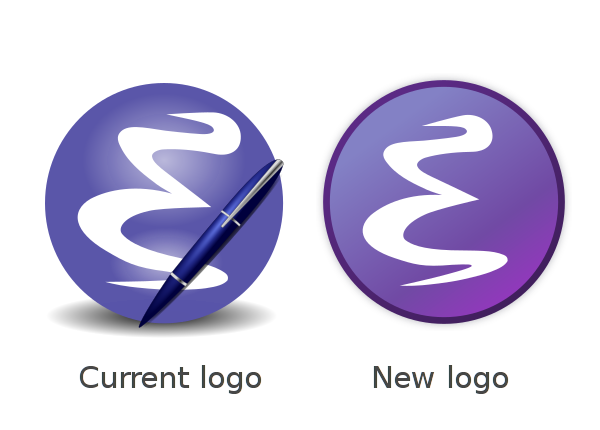
One important constraint is that the logo should still be immediately recognizable as being Emacs, so I decided beforehand to keep the shape (the circle) and the "E" letter.
I decided to remove the pen, flatten the circle, and changed the gradient of the logo to warmer shades of purple. I also changed the orientation if the E, to look more dynamic (looking up instead of down).

I have so far received very positive feedback!
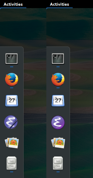
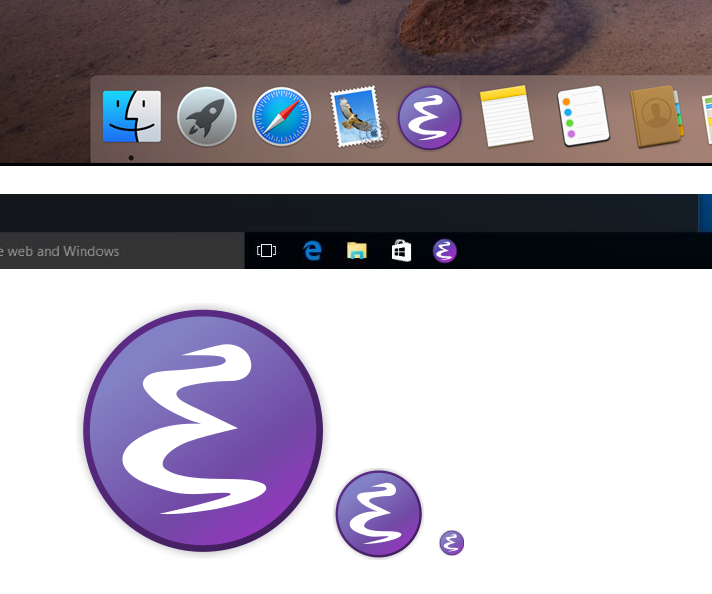
Here's the result, displayed in the 3 major desktop environment, with the current logo on the left to get a bit of context.


Feedback welcome!
comments powered by Disqus