
A Superia-like Fujifilm recipe
A Superia-like Fujifilm recipe
Ever since I stumbled upon the work of Ritchie on Fuji X Weekly and his film simulation recipes, I've tried to set up my camera with various recipes and shoot jpeg only.
I found shooting jpeg quite liberating. I used to expose for highlights, sometimes shoot wider than necessary, thinking that I would figure that out later in post, knowing that my raw files have all the data I needed. In the end I spent more time editing raw files – with the trustworthy Darktable – than actually shooting.
Editing raw files can be very, very time consuming. To the point that I decided to only edit my best photographs.
I've realized that if I had to get everything right in camera, I would be forced to be more present when shooting, be more aware of the composition, colors and light, instead of delaying the creative part to later.
So I "loaded" a few film recipes that I liked: Kodachrome 64, Portra 400 and Superia 800, and went shooting jpeg-only for a few days.
Superia
While I really liked the aesthetics of both Kodachrome and Portra 400, I couldn't resist the amazing look of the new Classic Neg film simulation, and the various Superia recipes Ritchie has made on top of it. They're truly excellent.
I decided to search for a Superia-like feel (not necessarily one exact film).
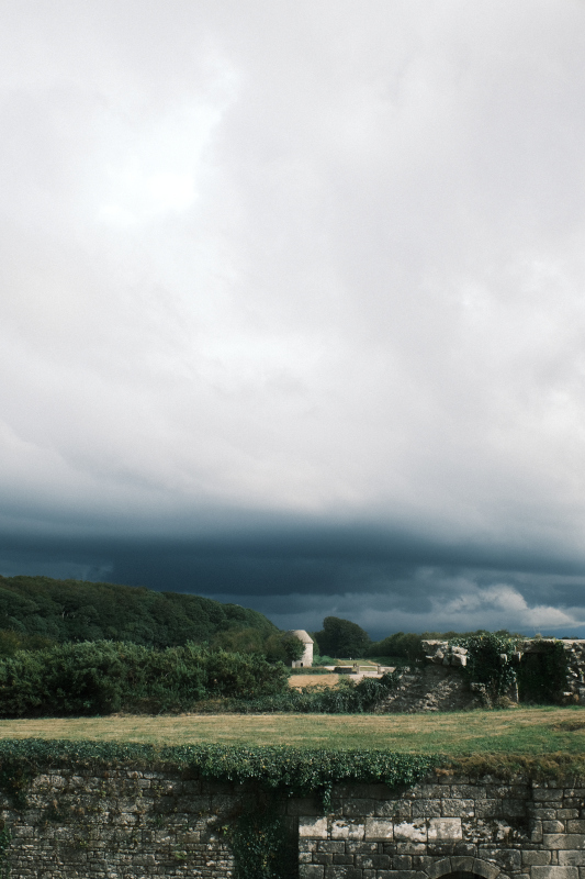
I live in a part of the world where the sky is often overcast… when rain is not pouring. Superia 800 is great in many situations, but it really shines in dreary days.
I found however that it is not very good for skin tones, as there's a quite strong yellowish or green cast to it, resulting in unnatural skin tone rendition. I then moved on to another Superia recipe from Ritchie: Superia 1600, which is nothing short of amazing.
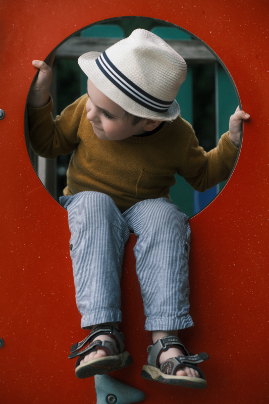
Superia 1600 has more contrast, but less color saturation. The white balance tint gives very pleasing skin tones, and it has this unmistakable Superia look.
I found it a bit too desaturated for my taste, though it can be used to great effect. I also found the grain to be too much. Since I didn't really try to emulate a specific Superia film, but rather to get a good general use Superia-like recipe, I ended up tweaking the Superia 1600 recipe to my liking, making it a tad richer in color, and less grainy.
I found that richer colors make the white balance shift more visible, especially on reds, browns and skin tones, which I like a lot.
- Classic Negative
- Dynamic Range: DR400
- Highlight: 0
- Shadow: +2
- Color: -1
- Noise Reduction: -4
- Sharpening: -1
- Clarity: -4
- Grain Effect: Weak, Small
- Color Chrome Effect: Strong
- Color Chrome Effect Blue: Strong
- White Balance: Daylight, +3 Red & +1 Blue
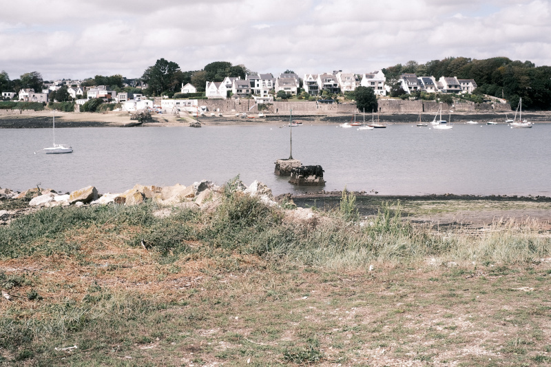
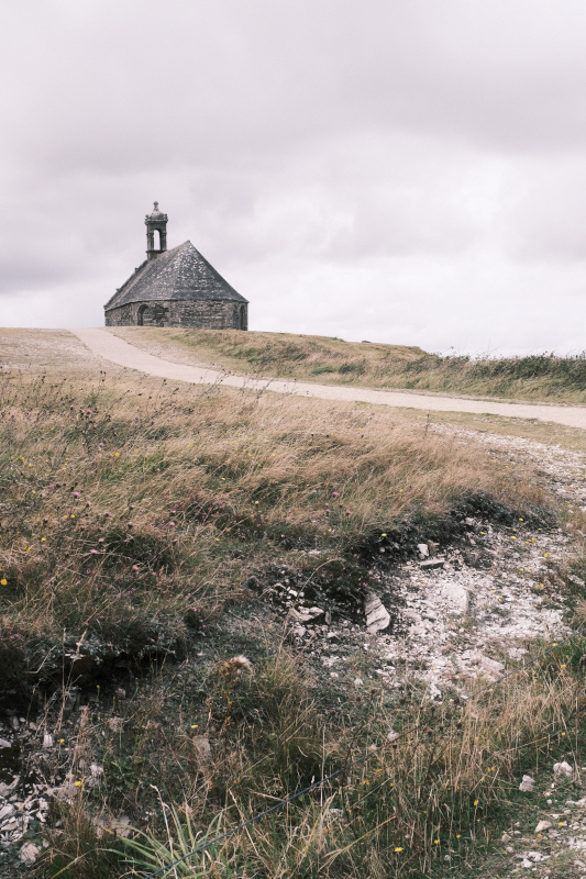
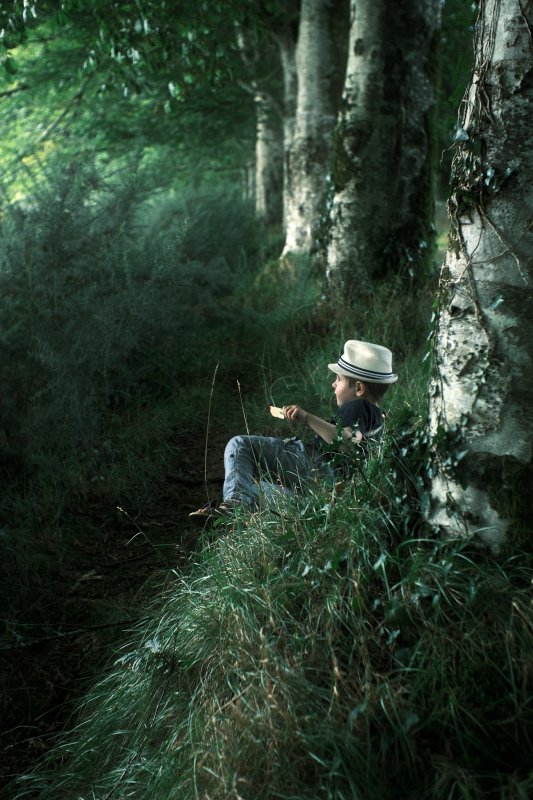
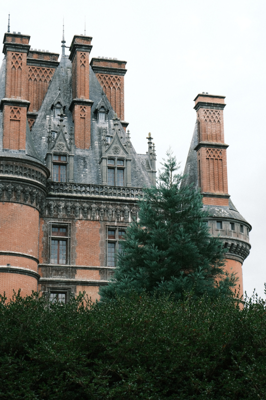
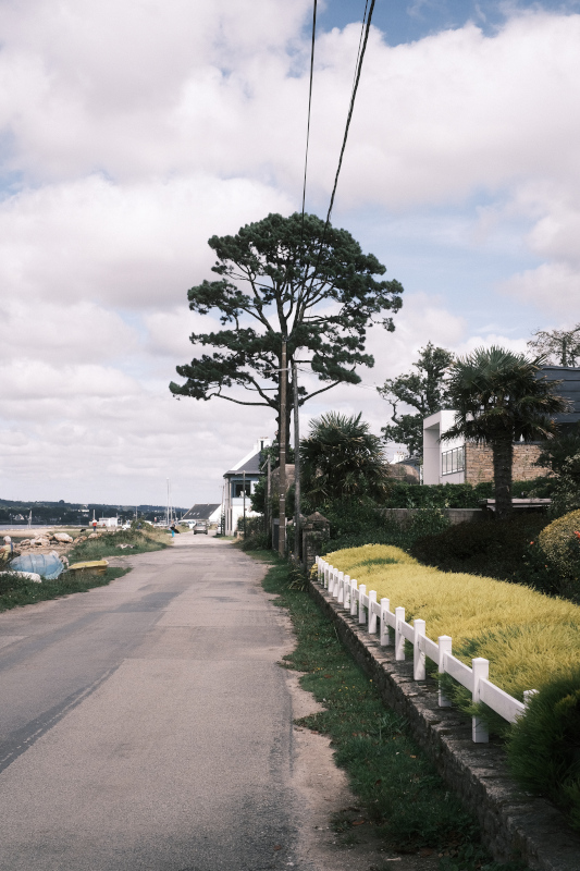
Sample images
Here are some photographs I took with the above recipe, straight out of camera.
Thanks a ton to Ritchie for his work on his film simulation recipes, be sure to check his blog at fujixweekly.com!
comments powered by Disqus